Monday, January 27, 2014

James Tobin on Inflation and Unemployment

Now that the Phillips curve seems to be back in vogue, the Tobin view of inflation and unemployment is relevant again.

In 1971, James Tobin gave a speech to the American Economic Association on the topics of inflation and unemployment, and the intersection between the two. The speech would later be printed as a paper. In order to understand the connection between inflation and unemployment, Tobin first turned to the definition of full employment.

So what is full employment? Well, full employment is where the supply of labor and the demand for labor are in equilibrium. But that's just a theoretical definition. When observing the real world, how would we know if the labor market was in equilibrium? Before Keynes, the answer was pretty simple: whatever state the labor market was in was an equilibrium state; supply met demand. But the pairing of this theory with the empirical observation that nominal wages refuse to fall has silly implications: mainly, that large bouts of joblessness are caused by a huge section of the labor force deciding that they were paid too little and leaving the labor market to pursue other endeavors.

Luckily, John Maynard Keynes came along and suggested something else. Keynes argued that the labor market wasn't always in equilibrium. However, if it was in equilibrium - if the supply of labor perfectly intersected with the demand for labor - then we would be at a point in the economy where an increase of aggregate demand would not be able to produce any additional employment or output. This would lead to a definition of full employment known as the non-accelerating inflation rate of unemployment (NAIRU) that manifested itself in the real world by the observation that a labor market in equilibrium led to a constant rate of inflation. If the labor market was not in equilibrium - if demand was greater than supply, say - then we would see an accelerating rate of inflation.

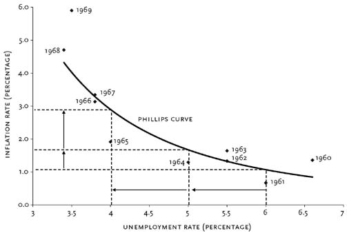
But Tobin was unconvinced of this definition. He didn't think that the rate of inflation really revealed the true preferences of the labor market. Instead, Tobin believed that the "responses of money wages and prices to changes in aggregate demand reflect mechanics of adjustment, institutional constraints, and relative wage patterns and reveal nothing in particular about individual or social valuations of unemployed time vis-a-vis the wages of employment." In other words, accelerating inflation wasn't a sign that the demand for labor was greater than the supply of labor. This meant that, as the Phillips curve suggested, lower unemployment could be bought at the "cost" of higher inflation.


But, if inflation isn't the labor market signalling that there is excess demand, then what is the connection between inflation and unemployment? More specifically, why is higher inflation associated with lower unemployment? In order to answer this question, we have to have in mind a model of how a truly efficient and optimal labor market would work. Tobin asks us to imagine an economy run by an omniscient and beneficent economic dictator:
An omniscient and beneficent economic dictator would not place every new job seeker immediately in any job at hand. Such a policy would create many mismatches, sacrificing efficiency in production or necessitating costly job-to-job shifts later on. The hypothetical planner would prefer to keep a queue of workers unemployed, so that he would have a larger choice of jobs to which to assign them. But he would not make the queue too long, because workers in the queue are not producing anything.
Of course he could shorten the queue of unemployed if he could dispose of more jobs and lengthen the queue of vacancies. With enough jobs of various kinds, he would never lack a vacancy for which any worker who happens to come along has comparative advantage.
In other words, what is seen as excess demand (more vacancies than unemployed workers) is actually an indicator of a functional labor market that optimally allocates scarce labor resources.


Or: if this is the true model for an efficient labor market, then it becomes easier to see why inflation doesn't represent a market failure but actually represents the mechanics of a well-functioning (at least, well-functioning compared to the alternative) market for labor. But in order to see that, we have to leave our nice theoretical model and get back to the real world.

So then what's the deal with inflation and unemployment? Well, it turns out that the economy "has an inflationary bias: When labor markets provide as many jobs as there are willing workers, there is inflation." All of this has to do with the observations that (1) there is no such thing as a labor market (singular); and (2) the relationship between wage changes to labor demand/supply is non-linear. 

(1) When we refer to the labor market (singular), we're actually referring the aggregation of a bunch of heterogeneous labor markets (plural); labor markets (plural) that are facing their own supply, their own demand, and their own adversities. And it turns out, these markets (plural) are very rarely in equilibrium.

(2) If the relationship between wage changes to labor demand/supply is non-linear, then that means that it takes a hell of a lot more excess labor supply to cancel out the increase in wages resulting from excess labor demand.

Combining these two properties into an example makes the inflationary bias clear: If there are two labor markets that are in disequilibrium, one suffering form excess demand and one suffering from excess supply, then getting both markets into equilibrium would require a transfer of the excess supply in one market to meet the excess demand in the other market. But, since the function relating wage changes to labor demand/supply is non-linear, this means that the magnitude of the fall in wages in one market is more than canceled out by the rise in wages in the other market, resulting in an economy-wide rise in wages (otherwise known as inflation).

And this is why higher inflation is associated with lower unemployment. In sum, an optimal allocation of unemployed labor resources requires the "excess" demand of more vacancies than unemployed workers; this implies inflation. Furthermore, the observations that there are many distinct labor markets that are often out of equilibrium and that the function relating wage changes to labor demand/supply is non-linear means that if employed labor resources are to be free to move to more efficient uses, then, once again, inflation will be a byproduct. 

Tuesday, December 10, 2013

Ben Bernanke on the Length of the Great Depression

In 1983, Chairman Ben Bernanke (then a professor at Stanford) wrote a paper titled Nonmonetary Effects of the Financial Crisis in the Propagation of the Great Depression. Roughly translated into English, that would be: Why Banking Failures Made the Great Depression Last Longer.

Before Bernanke wrote this paper, most mainstream economists had reached a general consensus on how the financial crisis of 1929 started the Great Depression and how subsequent financial crises aggravated the Depression. In other words: economists knew how problems that started in the financial sector led to problems in the real economy. This understanding came mainly from the work of Milton Friedman and Anna Schwartz. In A Monetary History of the United States, Friedman and Schwartz argued that the main avenue by which financial crises during the Great Depression affected the real economy was by leading to a rapid drop in the money supply. A good allegory for how an insufficient supply of money leads to problems in the real economy is the baby-sitting coop story. Paul Krugman retells it here and it really is worth the quick read. However, if you're looking for a one-sentence summary: shortages of money dissuade people from trading with one another leading to a fall in economic activity.

Now, as nice as Friedman's and Schwartz's theory was, it was still incomplete. While it could explain the role played by bank failures in causing the initial severity of the Great Depression, it could not explain the role played by bank failures in causing the Depression's prolonged nature. Why? Because if you read any economics textbook, it will tell you that a change in the money supply can have short term effects on real economic activity; however, once the economy has had enough time to fully adjust its wages and prices, then you're back to the original level of economic activity. Given that the Great Depression lasted from 1929 until the beginning of World War II, it's pretty obvious that a fall in the money supply wasn't the whole story.

Enter: young Ben Bernanke.

Okay, maybe not this young.
Bernanke argued that the main service that the financial sector provides is the ability to discern "good" borrowers from "bad" borrowers (this isn't the innovative part of his paper; I'll denote that with a *). But the market for loans isn't a complete market. Whether or not a borrower is good or bad is information only known to the borrower (and sometimes not even known to the borrower him/herself). Sure, you could use various indicators such as credit scores to try to guess this, but it's still an imperfect method. Furthermore, borrowers aren't a homogenous group. Borrowers are, well, people. And it takes time to get to know people. But if there's one thing that banks have: it's time (money, also).

Banks gathered information on their customers that enhanced their ability to discern between good and bad borrowers. Maybe after a manufacturing firm paid back a loan to a bank, the bank may have learned that the manufacturing firm was a well-run business that was worthy of further loans. Or maybe after a farmer paid back a loan to a bank - even during a down year for crops - the bank learned that the farmer had the ability to weather down years and was also worthy of further loans. Unfortunately, this sort information is very hard to gather and it takes a lot of time. So whenever a bank failed, all the hard-won information that the bank had on its borrowers disappeared with the bank. The borrowers could try to get loans from other banks, but there was an economic depression and banks were very wary to lend money - especially to people they knew nothing about. The squeeze on credit that resulted from the financial crises directly translated to a fall in aggregate demand, prolonging the Depression*. Since it takes a long time to build new relationships between borrowers and lenders, this meant that the fall in economic activity would last for some time.

And this is partly why the Bernanke-led Fed worked so hard during the height of the financial crisis to stop solvent banks from failing and to get insolvent banks bought up by other banks. They didn't want the institutional knowledge of the failing banks to be lost because that would have meant a much longer period of economic depression. Unpopular? Yeah. But a guy who wins his state's spelling bee at the age of 11 probably wasn't going to win any popularity contests anyway.

Friday, November 22, 2013

Monta Python and the Holy Fail

Monta Ellis has been playing phenomenally. Granted: we're only 12 games into the season. Whether or not Montaball continues to be a noun that is associated with positive feelings remains to be seen. Given my description of Monta's play so far, this begs the question: if Monta is playing so well, then why the title "Monta Python and the Holy Fail"? Because: 1) I thought it was clever; and 2) Monta Ellis represents one of the current failures of basketball analytics: the ability to separate player from context.


This is a difficult problem. Basketball is not baseball. In both sports, a player's performance is affected by external variables. But in baseball, those external variables are easily quantifiable. Not so much in basketball. In basketball, we have to rely on imperfect proxies. An interesting example of this is shown in the below video in which Ben Alamar, a former analytics consultant for the Thunder, describes how he estimated Russel Westbrook's passing abilities. Westbrook's passing abilities were influenced by external factors such as: UCLA's shooting ability, UCLA's offensive scheme (Westbrook mainly played the 2), opposing team defensive schemes, etc. To control for this, Alamar simply looked at the probability of Westbrook's teammates making a shot. If this probability is significantly higher after receiving a pass from Westbrook, then this would suggest point guard-esque passing skills.


But back to Monta. Maybe the Dallas Mavericks' front office had advanced statistics that suggested that Monta is a more efficient player than his statistics say. However, those of us not in the front office did not have access to such numbers. All we could do was look at his stats and say that this is a guy who shoots four three-pointers a game even though he only shoots the three at a 28.7% clip. Of course, what was missing was the context. Bluntly put: Monta was expected to carry the offense of a team that didn't complement his skills well.

Which brings us to the two questions that this post is trying to answer: where is Monta's increased production coming from and is it sustainable? To answer these questions we will look at three Montas: 2007-08's Good Monta, 2012-13's Bad Monta, and 2013-14's So-Far-So-Good-But-Let's-Hope-He-Can-Keep-It-Going Monta. Emphasis will be placed on the latter two.

Where are Monta's points coming from? Here is a chart that breaks down his points per game by shot distance for the 2012-13 and 2013-14 seasons:


And a chart showing the difference in PPG by shot distance between the two seasons:


What these charts tell us is that of the seven distance categories, Ellis has increased his scoring output in five of them. These five categories account for a 6.03 PPG increase in scoring (partially offset by a 1.86 PPG decrease in scoring in the the other two categories). 62% of the 6.03 PPG increase comes from two areas: the 20-24 ft. shot and free throws. Of course, the increase from free throws is a good indicator of sustainability while the increase from the 20-24 ft. shot is a bad indicator of sustainability. However, don't overreact too much. If Ellis kept his PPG differential in all categories except for the 20-24 ft. shot, while his 20-24 ft. shot regressed back to last year's form, Ellis would still average 20.6 PPG versus his current 23.3 PPG. Which leads us back to the second question that we asked: is his increased production sustainable? To answer that, we're going to have to look at his field goal percentages.

Here is a chart that breaks down his field goal percentage by shot distance for the 2012-13 and 2013-14 seasons:


And a chart showing the difference in field goal percentage between the two seasons (note: difference is percentage point difference):


Monta's field goal percentage this year is 7.96 percentage points higher than last last year (49.5% vs. 41.6%). From 5-9 ft. Ellis is shooting 18.97 percentage points higher. From 10-14 ft. Ellis is shooting 9.54 percentage points higher. From 15-19 ft. Ellis is shooting 24.71 percentage points higher. From 20-24 ft. Ellis is shooting 11.4 percentage points higher. These four areas are likely candidates for regression and account for 3.78 PPG (over 60%) of the 6.03 PPG increase (once again, this 6.03 PPG increase is partially offset by a PPG decrease in two of the areas).

So has Monta illegally taken up camp at the tail-end of the normal distribution and should expect to be evicted by the sheriff soon? Or has the extra space created by Dirk really been all that was standing in-between Monta Ellis and having it all? Unfortunately, this brings us back to the failure of basketball analytics. We just don't have the ability (yet, hopefully) to quantify the difference that Dirk makes on his teammates' shooting percentages. We can, however, create proxies by looking at two natural experiments in the history of the Dallas Mavericks: the trading of Devin Harris to New Jersey and the signing of Jason Terry. I submit that the difference in field goal percentage between Dallas Mavericks Devin Harris and New Jersey Nets Devin Harris as well as the difference between Dallas Mavericks Jason Terry and Atlanta Hawks Jason Terry can give us an (very) imperfect approximation for how much production we should expect Monta Ellis to be able to sustain.

Here is a chart that shows Devin Harris's field goal percentage by shot distance:


Here is a chart that shows Jason Terry's field goal percentage by shot distance:


And a chart that shows Jason Terry's and Devin Harris's combined field goal percentage, weighted by shot attempts:


By using the difference in field goal percentage between Harris's and Terry's time in Dallas and Harris's and Terry's time in New Jersey and Atlanta, we can approximate how much we can expect a similar guard (e.g. Monta Ellis) to improve upon playing in a Mavericks' uniform next to Dirk. Unfortunately, it looks like Ellis is significantly overachieving. Here is a chart showing the increase in field goal percentages of Harris/Terry (weighted) and Ellis (note: this is percent difference and not percentage point difference):


Monta's increased efficiency in the 10-14 ft. range and the 20-14 ft. range is what you would expect. However, his increased efficiency in the 5-9 ft. range and 15-19 ft. range is off the charts (not literally, though). Even though the increase is much greater than expected, I think that this is mostly attributable to Ellis's terrible 2012-2013 season. Here is a chart comparing Ellis's 2012-2013 FG% with Harris's and Terry's pre/post-Maverick weighted FG%:


The percentages for 10-14 ft. and 20-24 ft. are similar. However, Ellis under-performs substantially in the 5-9 ft. range and 15-19 ft. range.

Where we are at right now is that we can argue that we should not expect Ellis to regress significantly in the 10-14 ft. range or the 20-24 ft. range. This gives us 2.4 PPG of the 3.78 PPG gross increase that we are trying to explain. So then what about the 5-9 ft. and 15-19 ft. range? This is where the 2007-08 season comes in - Monta's most efficient season. I'm sad to say: it doesn't look good. During the 2007-08 season, Monta shot 43.1% from the 5-9 ft. range and 42.4% from the 15-19 ft. range. If we expect Ellis to regress to those levels while maintaining his current efficiency everywhere else, then we can expect Ellis to score 22.1 PPG vs his current 23.3 PPG. Not bad.

But we can do better. If we assume that Monta's "true" non-Dallas field goal percentages are 43.1% and 42.4% from 5-9 feet and 15-19 feet (which is close to the Harris/Terry weighted non-Dallas 44.5% and 44.5% [not a typo - it's the same percent]) then we can assume that Monta can improve his FG% by the same magnitude as Harris/Terry. That is, we can expect Monta's FG% from 5-9 feet and 15-19 feet to regress from 50% and 60.6% to 44.6% and 47.7%. All else equal, this gives Ellis 22.44 PPG.

In summary: this is all imperfect and mostly bullshit. There are a ton of assumptions built into this estimate. It was a lot of work to get to the answer that most of our guts already gave us: expect Ellis to regress, but not by much. At least we can say that with a little more confidence, though.

Friday, November 15, 2013

Health Spending Projections Understate ACA's Cost Controls

Christopher Conover of the American Enterprise Institute is not buying the claim - from health economist and former Obama adviser David Cutler - that the Affordable Care Act will save the average family $2,500 in health care spending relative to the trend. Cutler wrote in the Washington Post:
Between early 2009 and now, the Office of the Actuaries at the Centers for Medicare & Medicaid Services has lowered its forecast of medical spending in 2016 by 1 percentage point of GDP. In dollar terms, this is $2,500 for a family of four.
Conover argues that, yes, the Medicare actuaries did revise their spending projections downward. However, these downward projections have nothing to do with the Affordable Care Act. In fact, the actuaries project that health care spending is higher in a world with the ACA than it is in a world without the ACA. Here's Conover:
So according to the Medicare actuaries, not only is the ACA not a significant part of the reason health spending is slowing down in recent years, factoring in the ACA has resulted in even higher spending than was expected when the law was scored 3+ years ago.
And Conover is right. Just pointing to a decrease in projected health care spending and saying, "That's all ACA, baby!" is wrong. But what's also wrong is pointing to the increase in health care spending attributable to the ACA and treating it with the same disdain that you would with past increases in health care spending. In other words: yes, because of the ACA, national health care spending will be higher. But, because of the ACA, more people will have the ability to spend money on health care; so what did you expect?

Omitting the fact that the main reason that the ACA will increase national health care spending because of increased access to health care is a big deal. And that's because one of the untold tragedies behind the statistic that the US spends more money per capita than any other developed nation in the world and still has worse outcomes is that we don't even spend that money on everybody. A large portion of the US population lacks meaningful access to health care. And the ACA helps to correct that; which is why any mention of the increase in national health care spending should be put in the context of increased access to health care.

One way to do that would be to normalize health care spending by dividing the number of dollars spent on health care by the number of insured Americans. This would have the effect of controlling for the increase in health care spending due to increased access. Of course, this method isn't perfect. You can still be uninsured and spend money on health care. However, I think that some of that imperfection can be mitigated by the fact that a large amount of the care provided to the uninsured is uncompensated care provided by hospitals. These costs are then generally passed on to the insured. Put another way: one could argue that health care costs are borne almost entirely by the insured and not by the general public (ignoring Medicare/Medicaid taxes, obviously) so that the effect of normalizing health care spending by the number of insured Americans is that you have a statistic that roughly shows the share of health care spending that an insured American is "responsible" for, i.e. the expected health care premium. Note: this number is much higher than the average premium people actually pay because this number includes Medicare and Medicaid spending.

After you account for the increase in the number of the insured as a result of the ACA, then the argument that the ACA will make the average family better off actually looks like a good argument. Here is a graph of my estimates of health care spending per insured American:


From 2014 to 2017 (inclusive), the difference between having the ACA and not having the ACA is $554, $723, $1001, and $1137 per insured American. So yes, total health care spending is higher, but the insurance base is broader and the costs are more spread out. On average and simply from a costs perspective, people who currently have insurance will be better off because of the ACA. Not to mention the currently uninsured who will be much better off. So while David Cutler's numbers may be wrong, his argument - that the average American family will be better off - isn't.

Caveat: it is possible that difference between the ACA spending and non-ACA spending can be fully explained by changes the ACA made to Medicare and that the average person will not see any of these savings in the form of insurance premiums. I think that this is unlikely. But even if it is the case, the average individual will still be made better off because of lower taxes and increased Medicare solvency.

Boring data attributions: The CBO provided insurance coverage projections. These projections were made before the Supreme Court ruling (meaning that they overestimated insurance coverage). These projections were used on purpose because CMS's health care expenditure projections were made before the Supreme Court ruling. I couldn't readily find non-elderly Medicare enrollment projections so I used the Census's population projections to suss out the differences.

Update: It's come to my attention that some people may disagree with the inclusion of Medicare and Medicaid spending and enrollment data. I disagree (you can view my comment to see some of my reasoning), but welcome arguments. However, I do agree that looking at private health spending in the context of private insurance coverage is useful. The following chart displays this ratio. Note: this data excludes Medicare, Medicaid, and CHIP enrollment and spending; however, it includes other government spending/enrollment such as Department of Defense and Veterans' Affairs enrollment and spending (mainly because finding the projections of these programs' spending and enrollment would take me a bit of time, although I imagine [but have not verified] that the ACA does not touch the DoD or VA).

The ACA still has the effect of spending less per insured than without the ACA (except for in 2013, which is probably a rounding error). From 2014 to 2017 (inclusive), the savings are a much more modest but still impressive $105.92, $271.40, $521.08, and $681.22 per insured American.

Friday, November 8, 2013

Rental-Backed Securities Pose Modest Threat

Jody Shenn of Bloomberg recently reported that the private-equity firm Blackstone recently debuted bonds backed by rental properties. David Dayen thinks this is a terrible idea. Matthew Klein says, "what, me worry?"

Dayen is worried about the parallels between rental-backed securities and mortgage-backed securities. He writes:
You’ll remember that mortgage-backed securities were bestowed triple-A ratings during the housing bubble, and that this spurred massive purchases, fueling demand for more and more home loans to create more securities. You can see the same thing happening in the rental market if these securities catch on. In fact, while the most attractive foreclosed properties have already been snapped up, homebuilders are constructing new properties specifically for single-family rentals. Some analysts are concerned that this gold rush will create a new housing bubble in the communities where Wall Street firms are purchasing homes.
 Klein disagrees and says:
Where Dayen goes wrong is assuming that these securities will help fuel another bubble and crisis, or breed “absentee slumlords.” The less exciting reality is that the rental market for single-family homes will probably remain a niche business that will be profitable for some people and make little difference to the rest of us.
Klein argues that the systemic risks of rental-backed securities are small because the size of the rental securitization market is small and is likely to remain small:
When the strategy first developed in 2011, investors could buy and renovate thousands of foreclosed homes on the cheap and rent them out for after-tax yields of as much as 8 percent. At the same time, they could position themselves to benefit from any rebound in housing prices. That made single-family houses attractive to investors hunting for returns of as much as 25 percent. But then places such as Phoenix became saturated with investor capital, house prices soared and yields fell. Investors moved on to Atlanta. As the housing market recovers, the opportunities for big gains will diminish.
Matthew Klein makes a good point here. The logic behind the housing bubble was that mortgage-backed securities remained profitable so long as housing prices continued to rise. The logic behind rental-backed securities seems to be the opposite: that rental-backed securities remain profitable so long as you can purchase rental properties while housing prices are depressed. Rising housing prices will, instead of reinforcing an asset bubble, serve as a check on any sort of bubble formation.

However, I'm not entirely convinced by Klein that rental-backed securities pose little threat. First, despite their AAA rating, these rental-backed securities are still quite risky - much more risky than mortgage-backed securities. Part of the logic that explained why mortgage-backed securities were less risky than individual mortgages was that the mortgages that made up the securities were geographically diverse. That's not the case with rental-backed securities. Blackstone's rental-backed securities are geographically concentrated. And they have to be to make property management feasible. One bad stroke of economic luck in the West could wipe out these securities.

Second, even though the size of the rental market is relatively small, it's possible that the market could gain disproportionate importance in the financial sector. Just as we saw during the MBS bubble, financial instruments such as synthetic CDOs and credit default swaps can magnify relatively small losses in the real economy. Furthermore, much of the money behind Blackstone's deal came from a 2 year loan with a floating rate. If the Fed overreacts to a future sign of inflationary pressure, it's possible that Blackstone could be hit with a double-whammy in the form of higher interest payments and lower revenue from rental properties. In need of liquidity, Blackstone would be forced into the tough situation of selling geographically concentrated properties in a higher interest rate environment. If the losses - possibly magnified by credit default swaps and synthetic assets - are large enough, there could be big trouble in the financial markets.

Not to say that this is likely, though. But it is possible. And it's unclear whether the advantages of rental-backed securities outweigh these risks. On one hand, there will be greater stability in the rental market of a city during a city-specific economic downturn. On the other hand, the rental and housing markets of one city can possibly be affected by the rental and housing markets of another, distant city. And in specific cities, firms like Blackstone could, as Dayen notes, gain a disproportionately large slice of market power. Which is why I would rate my level of concern with rental-backed securities as cautiously neutral to mildly pessimistic.

Tuesday, October 22, 2013

CEA Weighs in on Government Shutdown

Private firms have given their estimates on the effects of the government shutdown on GDP. Macroeconomic Advisers says 0.2 percentage point. JP Morgan says 0.2 percentage point (no link). S&P says 0.6 percentage point. Goldman Sachs says 0.5 percentage point. Now, the President's Council of Economic Advisers is having their say and their whack at the pinata yielded a 0.25 percentage point loss in fourth quarter GDP (at an annualized rate, of course). This is more in line with the estimates of Macroeconomic Advisers and Goldman Sachs. However, the CEA goes one further than the private estimates and tacks a jobs number to their estimate: 120,000 less jobs created in the private sector for the first two weeks of October than otherwise would have been. Average the estimates out and you get a nice round 0.35 percentage point of lost annualized economic output in the fourth quarter.


But Jason Furman and the rest of the CEA are displeased with the private sector estimates (okay, they didn't actually say that). The CEA says that many of the private estimates of the shutdown's impact only took into account the direct loss of government spending and didn't take into account the broader effects of the economy - something that the Council of Economic Advisers did. How, you ask?

Well, every week the CEA releases their Weekly Economic Index. The WEI is created by the CEA by taking eight economic indicators and indexes, and performing what's called principal component analysis on them. This analysis captures a signal from the data that indicates which direction the economy is moving. The basic theory behind this is that the economy's movements have a predictable effect on certain indicators and that - since we can't directly observe the economy every week - we can estimate the weekly state of the economy from our observations of the indicators. After analyzing the indicators, the CEA normalizes that signal into one easy-to-digest number that corresponds with the annualized GDP growth rate. For example, if you have a WEI of 3.2, then if the economy grew at that week's pace for a whole quarter then you'd have a GDP growth rate of 3.2% for that quarter.   

So which 8 indicators does CEA use? The CEA follows two consumer spending indicators: ICSC's Same-Store Retail Sales and Redbook's Same-Store Retail Sales; two consumer confidence indicators: Gallup's Economic Confidence poll and Rasmussen's Consumer Index; two labor market indicators: Gallup's Job Creation Index and the Department of Labor's Initial Claims numbers; one industrial production indicator: the American Iron and Steel Institute's Raw Steel Production numbers; and one housing market indicator: the Mortgage Bankers Association's Mortgage Purchase Applications numbers.

Now, of course, these data are noisy. And the CEA warns against putting too much stock into one Weekly Economic Index number. All the WEI can do is give you an estimate of the state of the economy that week. One week may be good because it's the week of a holiday. Another week may be bad because the Heat won the championship and everybody is in a foul mood. But, when a large event occurs in the economy (a government shutdown in tandem with the threat of default, say), then you can make a reasonable assumption that the change in growth rates between two weeks is largely due to that event. And the CEA did just that. They saw that the week before the shutdown the economy was growing at a 3.6% clip. At the end of the first half of October, they saw that the economy was only growing at 2.0% clip - a loss of 1.6 percentage points of growth. Since the numbers are reported in a format of quarterly annualized GDP growth, they multiplied the weekly number by 2 (the shutdown lasted two weeks) and divided it by 13 (the number of weeks in the quarter). And that's how they priced the GOP's derp at 0.25 points of GDP growth. 


Thursday, October 17, 2013

Technical Difficulties

Here's an informative post by Simon Wren-Lewis on the difficulties that EU technocrats are having with calculating structural deficits. Essentially, Eurozone governments have to have their budgets approved by the European Commission. In order to be green-lighted for approval, the budgets have to meet some parameters related to the structural deficit. The problem? Structural deficits can be difficult to calculate in part because the natural rate of unemployment is hard to calculate. And it looks like the Commission is overestimating the natural rate of unemployment, forcing governments to run smaller deficits in a time when you really don't want to run smaller deficits.

Anyway, just something to note whenever chin-strokers propose technocratic solutions.